As a designer, I spend a lot of time thinking about how things look. Choosing the right colors, finding the perfect font, and getting everything to fit just right. But there’s another side to design that’s just as important: making sure it works for everyone.
Last week I attended CreativePro’s virtual Design + Accessibility Summit, where I explored all the ways thoughtful design choices can make information more accessible to everyone.
One of my biggest takeaways? Accessible design doesn’t have to mean completely rethinking your creative process. Sometimes, it’s simply a matter of paying closer attention to the details.
Here are three simple yet effective tips that stood out to me.
1. Don’t Let Color Do All the Talking
As a designer, I love a good color palette. But color shouldn’t be doing all the heavy lifting when it comes to communicating important information.
Think about a chart that uses red and green to distinguish between two categories. For someone with color blindness, that distinction might not be so obvious.
The solution? Pair colors with labels, icons, or patterns so the information is understandable regardless of how someone perceives color.
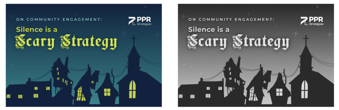
Quick tip: Try viewing your next graphic in grayscale. Does the message still come across? If not, consider adding another visual cue.
2. Give Your Content Some Breathing Room
We’ve all encountered a presentation slide or webpage packed with so much information that we don’t know where to look first.
Thoughtful spacing and a clear visual hierarchy do more than make a design look polished. They help readers process information and find what they’re looking for.
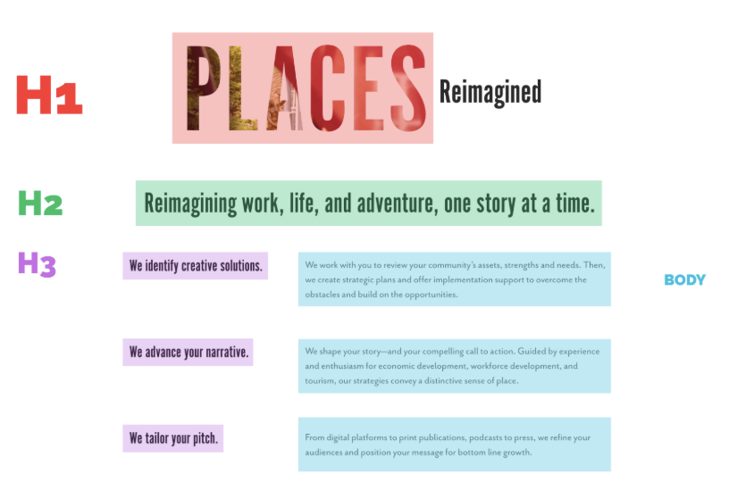
And here’s something I found particularly interesting: making text bigger and bolder doesn’t automatically make it a functional heading! Using actual heading styles in digital documents helps screen readers recognize how information is organized, making it easier for users to navigate between sections.
Quick tip: Before publishing your next document or presentation, take a look at its hierarchy. Are your headings organized logically? Can readers easily distinguish the most important information from the supporting details?
3. Think Beyond What You Can See
Not everyone experiences digital content visually, which means there’s more to accessible design than meets the eye.
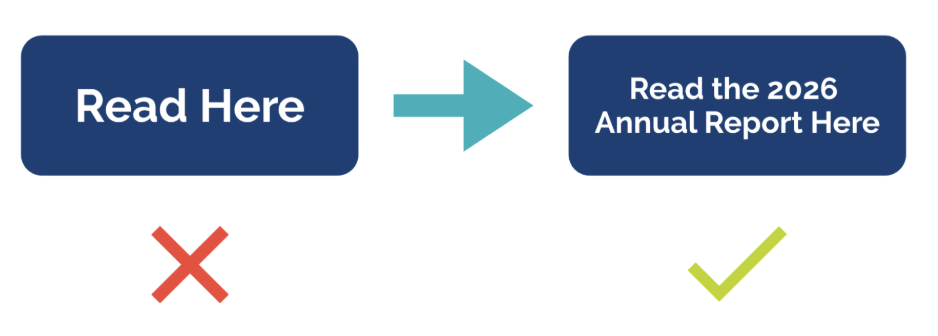
For example, alternative text (or alt text) provides descriptions of meaningful images for people using screen readers. Similarly, descriptive hyperlinks and clearly labeled buttons help users understand where they’re going or what action they’re taking.
Instead of a generic “Click Here,” try something more specific, like “Download the 2026 Annual Report.” This tells readers exactly what to expect before they follow the link.
It’s a small change, but it makes navigating content much more intuitive.
Quick tip: The next time you share an image or add a hyperlink, consider whether someone could understand its purpose without seeing it.
The Bigger Picture
One of the most important reminders I took away from the summit was that accessibility benefits more people than we might realize.
Whether someone is navigating a website with a screen reader, viewing a graphic in bright sunlight, or trying to follow a video in a noisy environment, accessible design helps make information easier to understand and engage with.
For organizations communicating with businesses, residents, and community stakeholders, that matters.
At the end of the day, effective design isn’t just about making something look good. It’s about making sure the message gets through.
And sometimes, a little extra attention to detail can go a long way.
Thanks for sharing these helpful insights, Olivia! If you need a designer’s lens to ensure accessibility for all, connect with our team!.